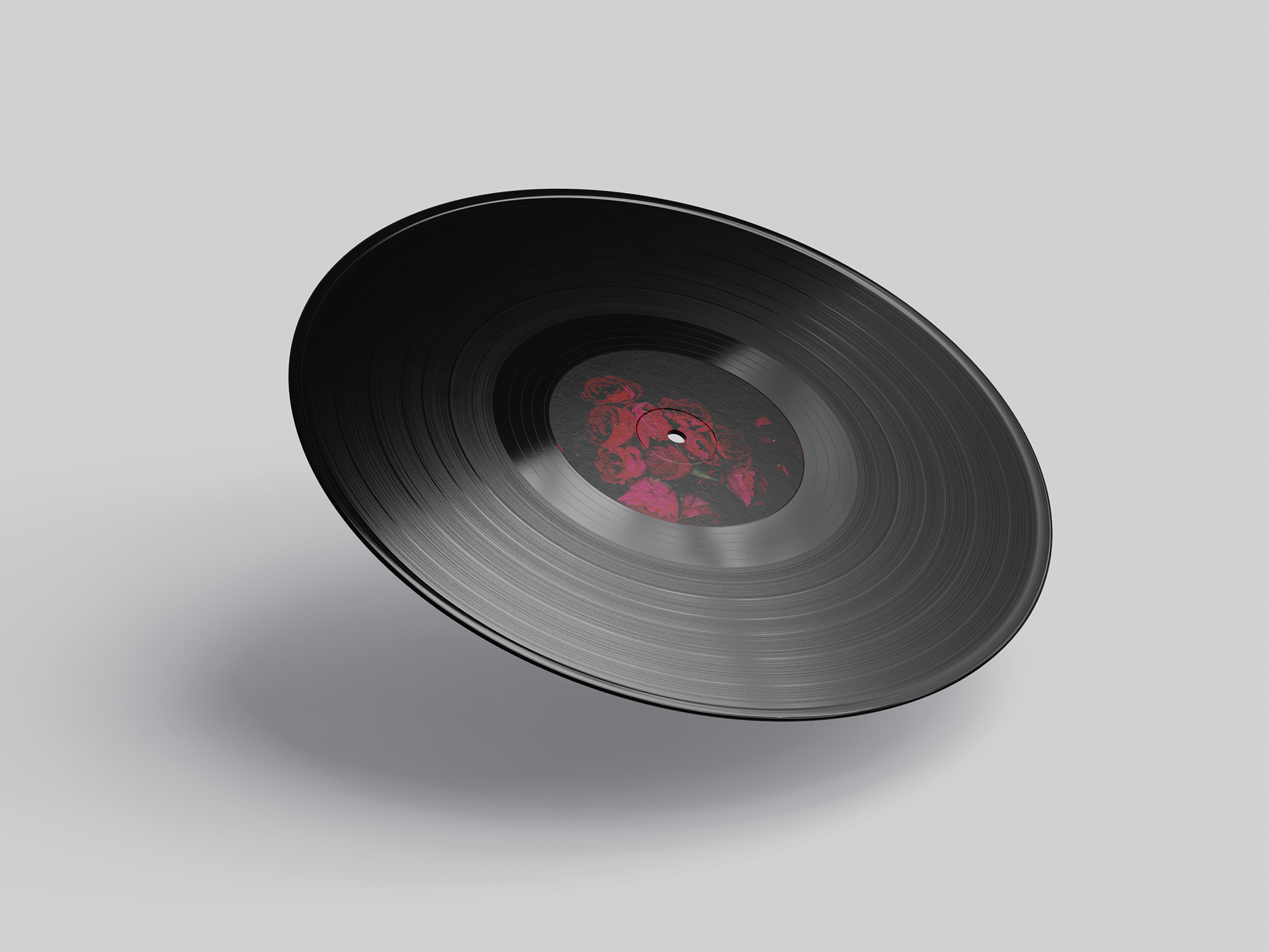
Lana Del Rey’s Born to Die album explores themes of love, heartbreak, and mortality. The concept behind the album artwork centres on the red rose a symbol of beauty that can also cause pain.
Twelve roses are featured, each representing one of the album’s twelve tracks, while the falling petals evoke a sense of tragic, romantic decay that echoes throughout the music. A black background sets an eerie, melancholic tone, reinforcing the darker themes.
The typography draws inspiration from classic Californian design, nodding to Lana’s deep connection with life in California, which serves as the backdrop for much of the album’s narrative.